
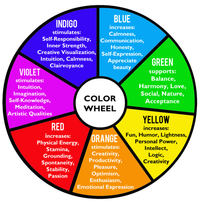
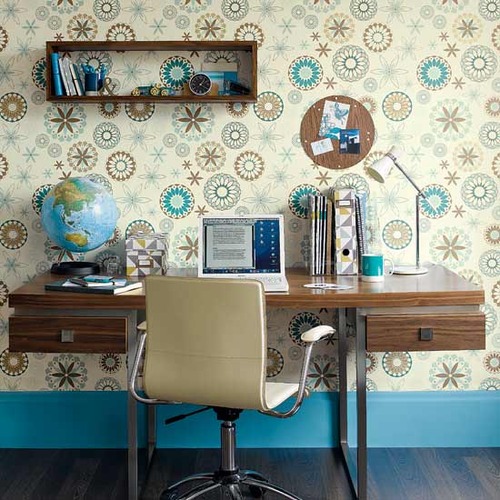
By using color therapy, also known as chromotherapy, when you are decorating your home or office, you can bring healing energies into your space and enhance or diminish certain qualities. Refer to the color therapy chart below for a more holistic approach.
“The soul becomes dyed with the color of its thoughts.”
– Marcelus Aurelius
Are you seeing red in the bedroom, or feeling blue about your bathroom? Maybe it’s got something to do with your interior decor. It’s long been recognized that colors are connected with emotions in the brain, and it’s also been proven that the colors of rooms you’re frequently in can affect your frame of mind, concentration and even digestion.
The answer for the grey moods could be a lick of colorful paint! Getting a hint of the right tint could lead to a healthier, happier, more productive home – so why not dig out your paint brushes and take a look at our rainbow of mood-enhancing possibilities?
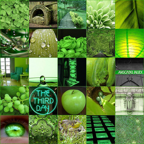
Green: A color that’s often used in hospitals, as it’s associated with health and efficiency. Depending on what shade you settle on, it can create very different effects: bright greens improve vision and create a refreshing atmosphere, while softer, more natural greens are calming.
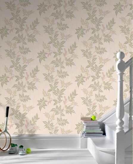
Mint green or heather green are welcoming shades, relaxing colors for hallways – fantastic for patterned wallpaper that’s not overwhelming. Mellower tones are also excellent for children’s bedrooms – pale turquoises and sea greens will settle them but won’t leave them feeling lethargic. As an added bonus, green doesn’t carry any gendered connotations, as do pink and blue.
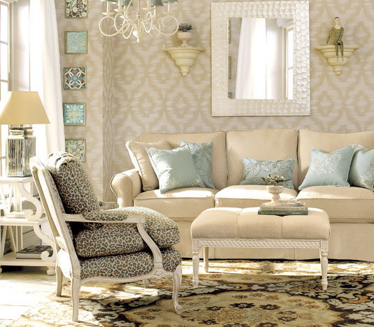
Cream: A very popular color, cream is neutral while being warmer than stark white – good if you’re planning to sell your house, as it creates a sense of space and cleanliness without making your rooms look unwelcoming and clinical.

Yellow: It’s said that babies cry more in yellow rooms – a very stimulating color, it enhances concentration and speeds the metabolism.
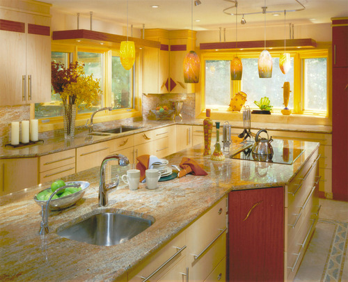
It’s often used in schools because it keeps the brain ‘switched on’ – in the home it’s great for studies and kitchens but bad for bedrooms and wind-down rooms. Pale yellow brightens an area where activities happen, giving a happy, positive atmosphere.
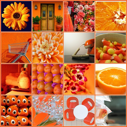
Orange: Orange can make a room look smaller, so if used in excess will make a space feel claustrophobic and stressful: not so good for bedrooms and studies because you might find it hard to sleep or concentrate.
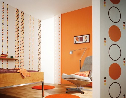
However, it aids digestion and increases appetite, as well as engaging the brain. Therefore, it’s great for kitchens, eating and play areas, as well as being good when applied to a single wall in a neutral color scheme – it adds a pop of liveliness and fun.
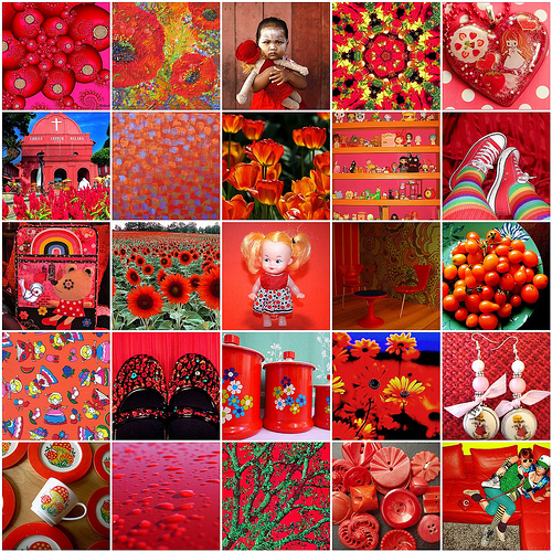
Red: Dark red can be a passionate color for bedrooms; rather than going all out with the same shade, it’s best to just have a ruby or maroon feature wall– too much can be unnerving rather than arousing.
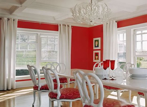
It’s also an appetite stimulant, so deck out your dining room with red details.
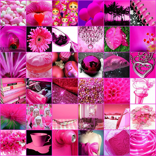
Pink: Traditionally seen as a feminine color, the preserve of girl’s rooms and nurseries, pink is one of the most comfortable and comforting colors out there.
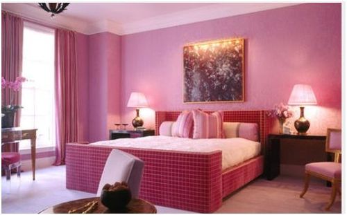
Try rich rose tints or pale pinks in bedrooms for a warm, nurtured night’s sleep and use peachier shades for bathrooms.
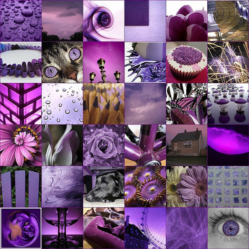
Purple: Lavender shades are a sedative: use wisely, as they can make a living room or dining room seem drowsy.
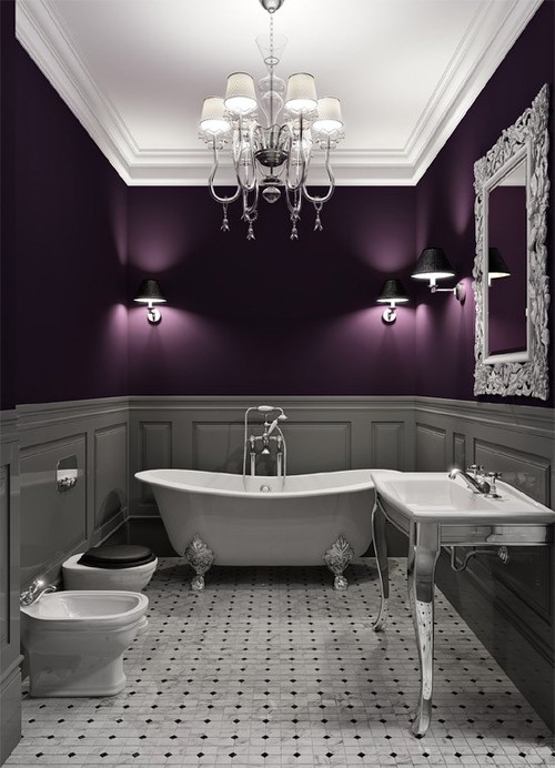
Dark, dramatic shades are fantastic in moderation but can have a bit of a depressing effect if used too much.
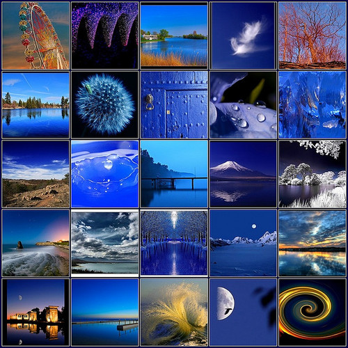
Blue: Though many people’s favorite color, blue can look cold and unwelcoming. According to a study by Pantone, office workers complained that an office was too cold when it was painted blue – but when it was painted a peachy shade they warmed up even though the temperature had not changed.
Blue suppresses the appetite and stimulates thought, so it’s bad for bedrooms and dining rooms; however, it’s an excellent color for studies and exercise areas.
source: http://blog.styleestate.com/style-estate-blog/what-colour-where-mood-enhancing-shades-for-decorating.html
Tags
red home decor pantone blue purple pink stimulating cream yellow relaxing mood-enhancing color therapy chromotherapy mint passion Green orange holisticYou Might Also Like


